If Your Brand Doesn’t Move, It’s Not Alive
Symbols created to last, not to move.
Motionless Heritage
For the past five thousand years — since Aten’s solar disc, the first radial divine emblem of Ancient Egypt — brands have stood still.
Not for lack of desire, but because they simply couldn’t. They were made to endure. To be carved in stone, woven into fabric, or forged in gold.
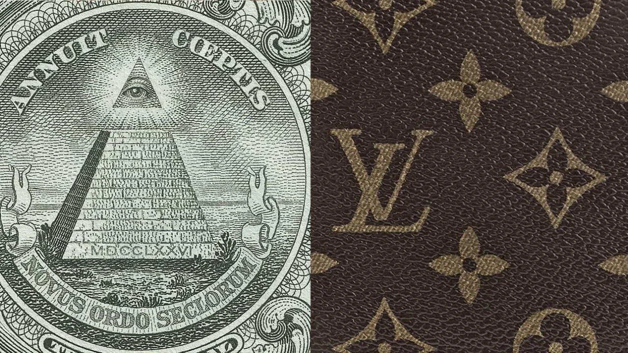
The Sun of Louis XIV, the Christian cross, England’s three golden lions, the pyramid on the Great Seal of the United States, Real Madrid’s crest, and the Louis Vuitton monogram — all were created to remain still.
And from that stillness, to rule.
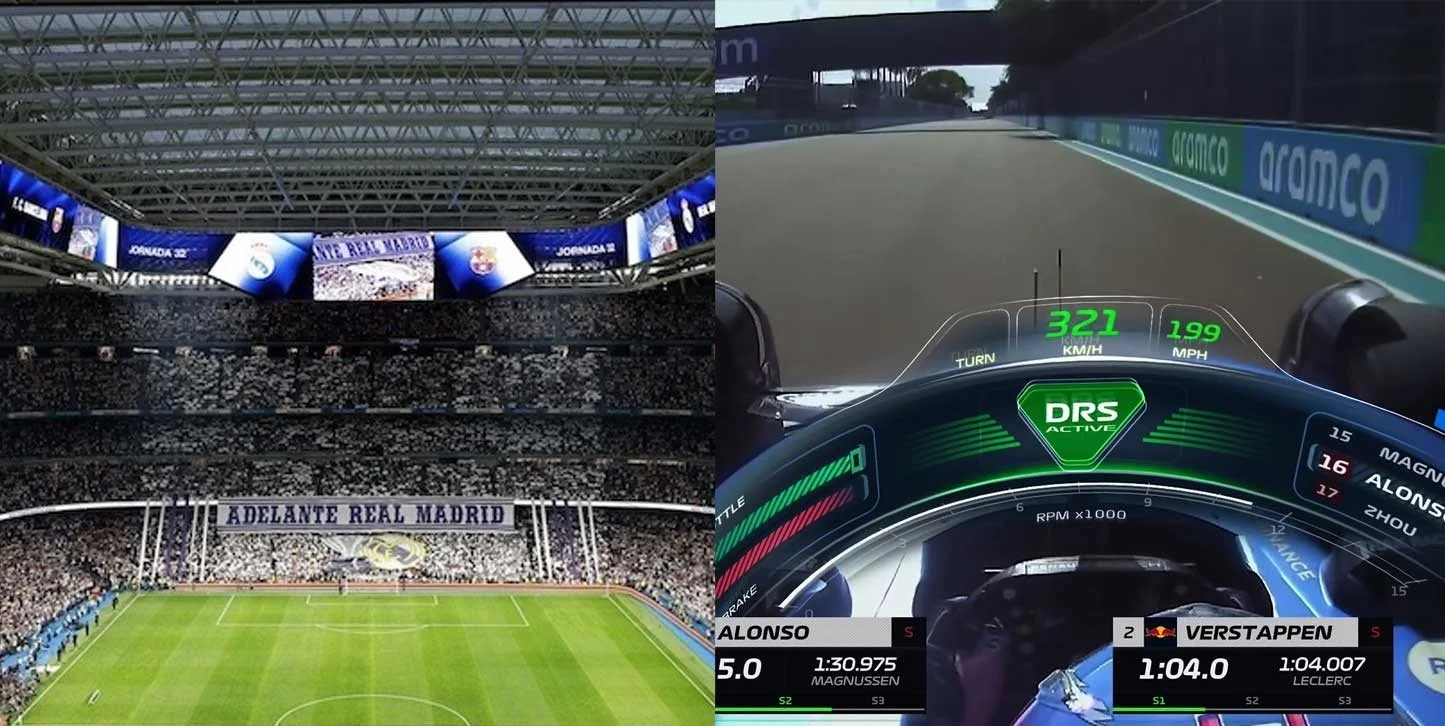
From screens to stadiums – the brand never stood still until it reached your hands,
But Even When You Hold It, It Might Come to Life…
We’ve been carrying screens around for years, but things are escalating — for better or worse. Glasses that project information, like Zuckerberg’s Ray-Bans.
Smartwatches that replaced ticking hands — pretending to look like a Rolex until, suddenly, a limited-time promo notification pops up. Fridges with screens have been around for a while, but cars deserve a special mention.
At the Munich Motor Show, the new Mercedes GLC unveiled a front grille with 942 LED points that can light up in sequence — animating a programmed visual welcome.
BMW’s iX3 offers the Iconic Glow package, with synchronised external light sequences that greet the driver with rhythm and sound — including a glowing BMW badge that animates like something out of Tron.
And the Audi A5 now features a panoramic roof with variable transparency, modulating light in animated strips. It’s still a bit clunky, but it hints at a future where surfaces behave like digital skin.
Audi, the pioneer of dynamic turn signals, now faces a wider design challenge. It’s no longer about innovating in hardware — it’s about crafting a coherent visual logic.
We’re talking about Motion Identity.
When light and glass become behaviour / Fragment extrated from youtube channel @carchannel911
Many Brands Are Still Designed as If They Were Only Going to Be Printed
Identities that are born to live on paper, labels, or static PDFs. Colour comes first, then type, then logo. And only at the end do we add the “Motion Principles”.
An animated logo, a web intro, a video transition, a nice mockup for a shop front. But that isn’t behaviour design. That’s what I call a belated add-on — when what used to be a dessert has become the main course.
Shouldn’t we already be thinking about how a logo moves while drawing it in Illustrator?Would anyone really disagree that a brand’s first impression today happens on a screen? And in that space, everything appears, slides, reacts. Movement is no longer a technical trick — it’s part of the message. And if it doesn’t come from the concept, it says nothing.
Designing without a coherent motion system is, to me, a "strategic omission".
Banamex’s Motion Identity developed by Plenty, in a collab with Interbrand
Brands Are No Longer Graphics. They’re Living Entities.
A brand now appears. Enters the scene. Has its own rhythm. Moves, pauses, reacts. It can walk, float, run. It can fade in silence or burst into action. Some have a dance step. Others, a way of breathing. It’s no longer about adding animation — it’s about designing a meaningful visual behaviour. An internal logic that connects every gesture to purpose.
That’s why, at Plenty, we’re developing a strategic and practical framework called Living Identities — a way to think of brands as living systems: entities that don’t just look a certain way, but behave with intent.
I’ll be sharing more about this in the next posts — and I’d love to open the conversation. If you’ve made it this far, I can guess this topic resonates with you as much as it does with me.
Mariano Farías.