Nat Geo Kids
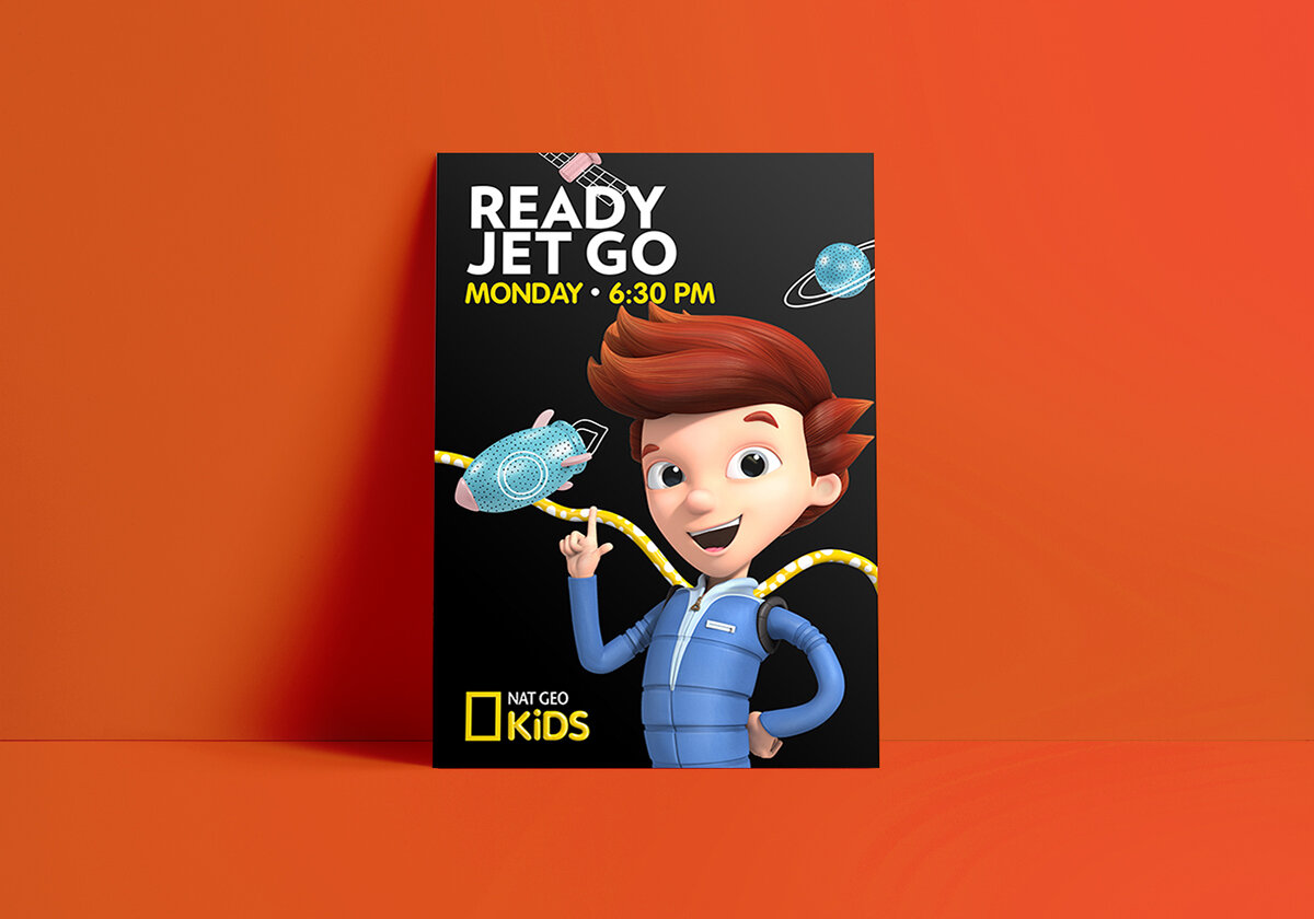
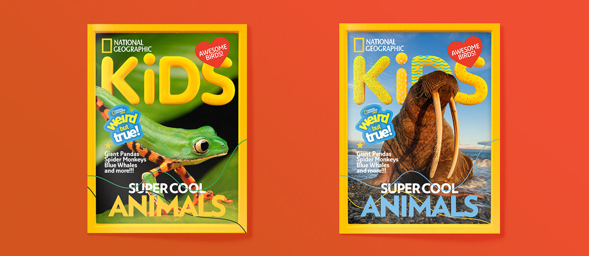
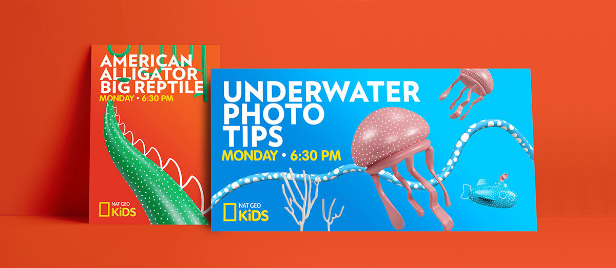
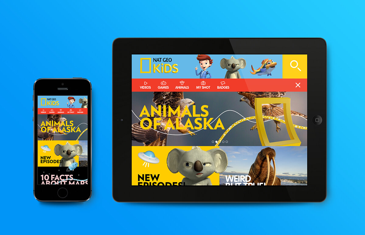
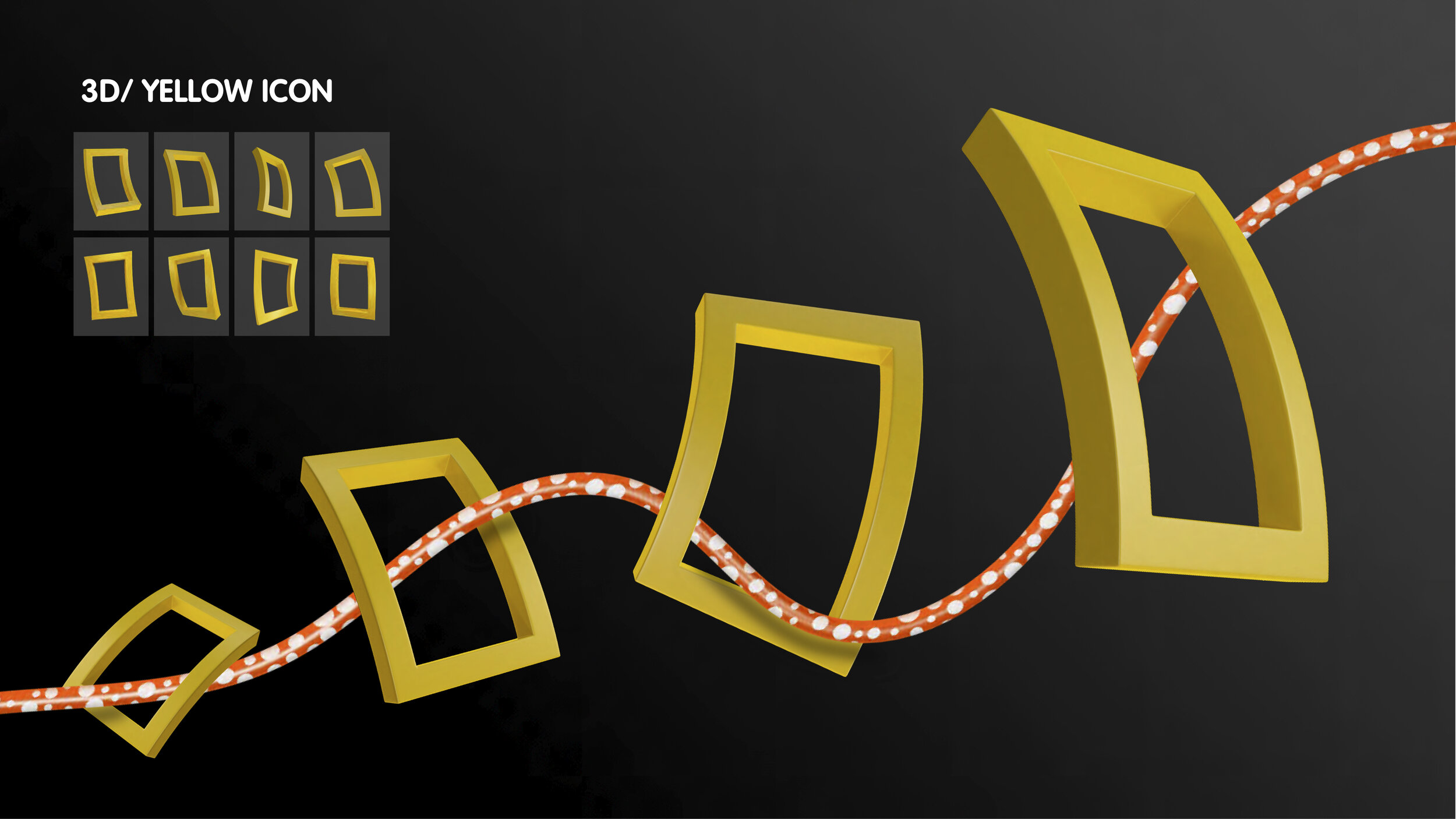
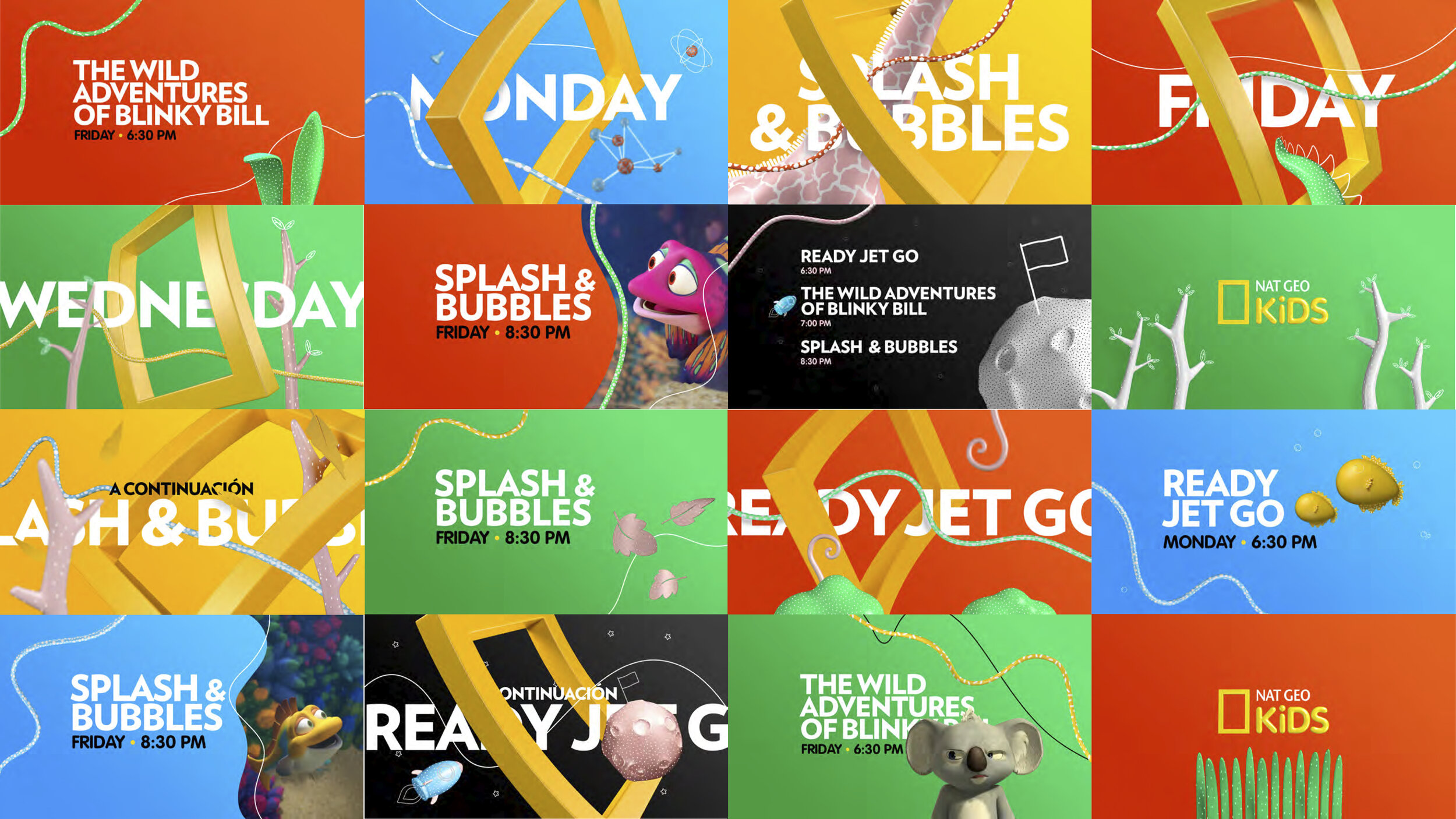
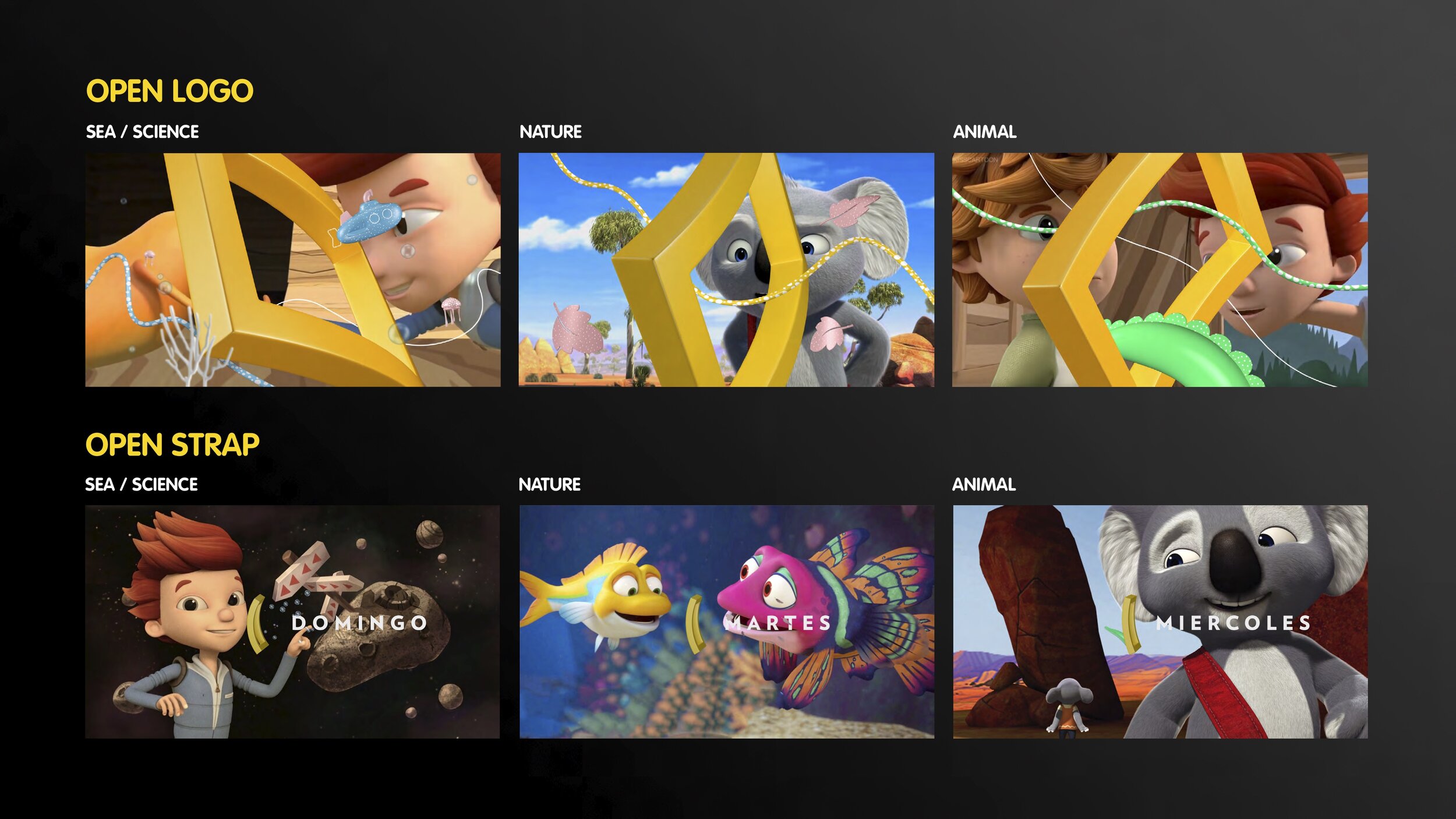
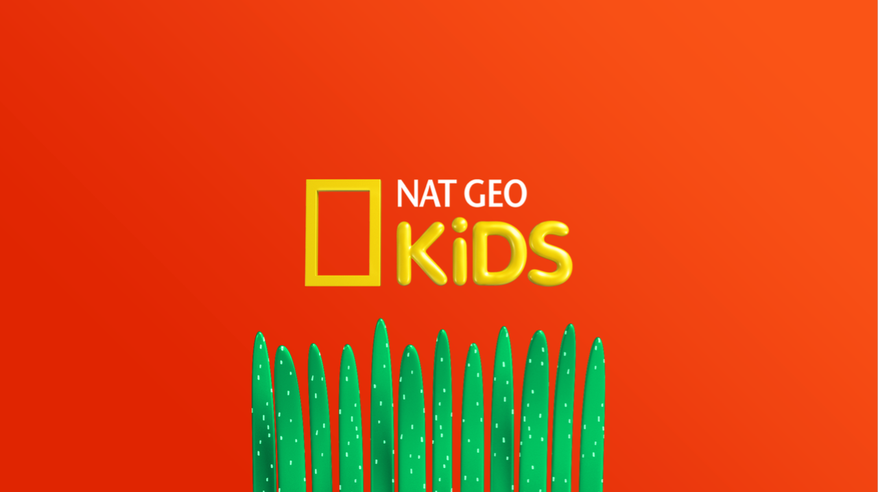
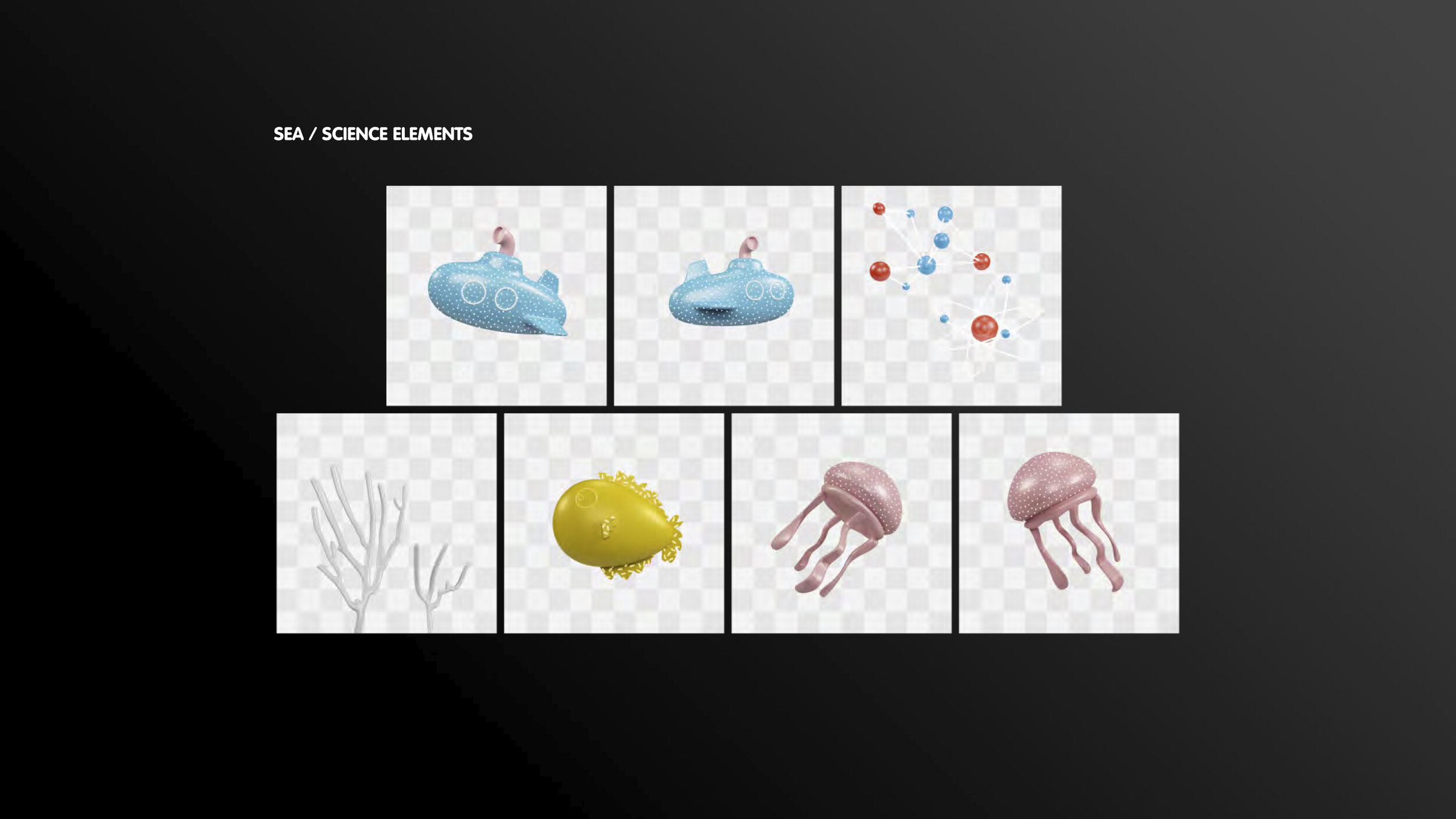
We're excited to announce the new brand image campaign for Nat Geo Kids. The project concept for this Rebrands was based on how to convert the Nat Geo logo, the world-famous Yellow Frame into a playful scenario taking the premise: "Because we know you are curious" as our starting point.
So we've focused on the Yellow Frame as the key element to transform Nat Geo, an adult brand into a positive, optimistic and kid relevant one: Nat Geo Kids.
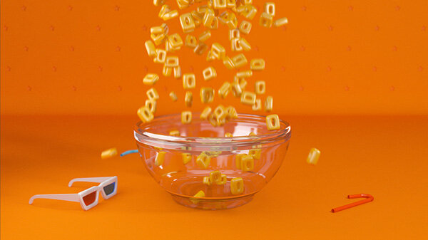
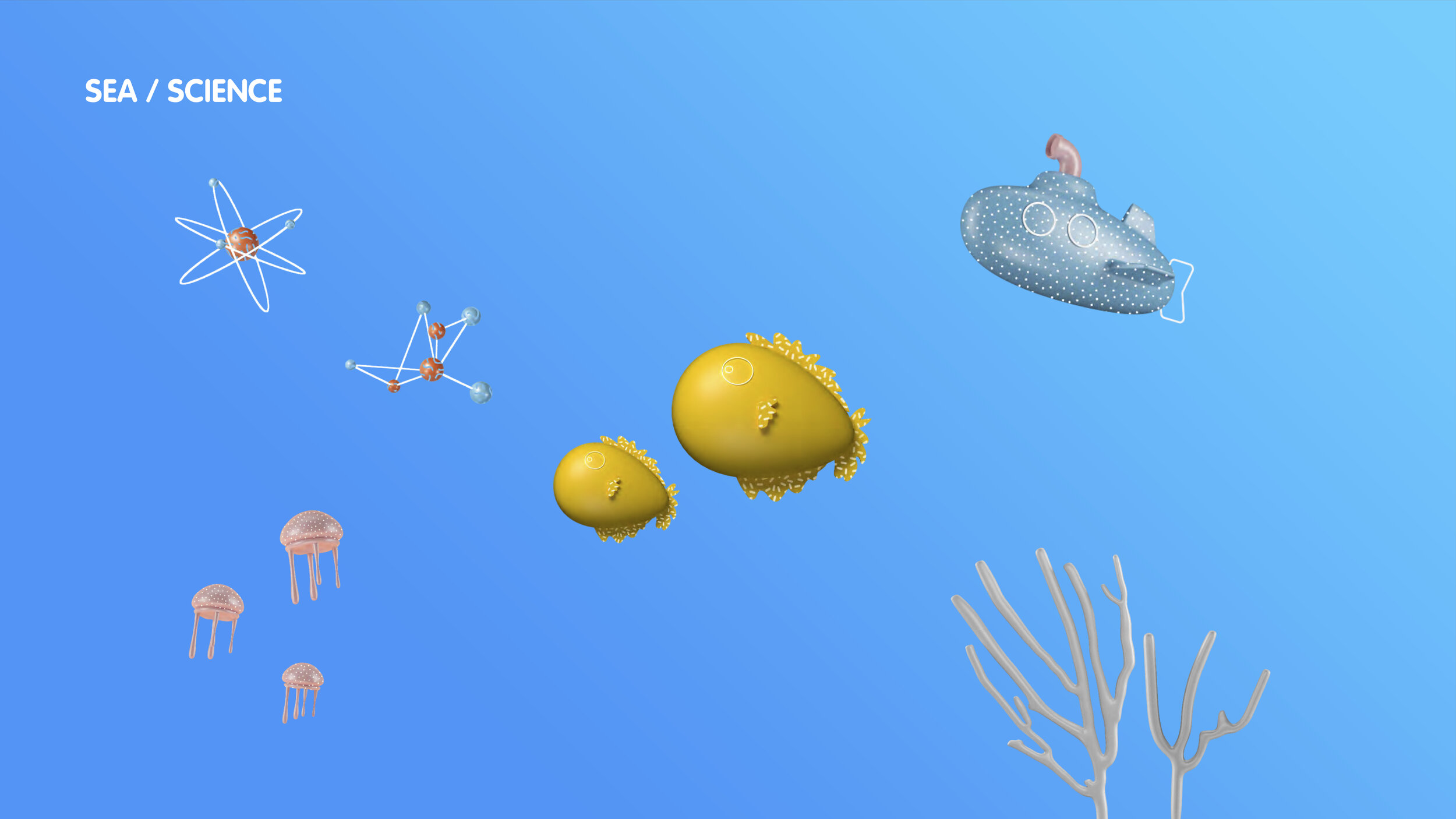
Using the logo as a container, the idea was to give a constant brand presence in every type of communicational piece, creating unique, smart and distinctive content, intending to motivate kids to feel excited about exploring the visual campaign, and offering a flexible communication system through which the brand connects viewers through a non-written message.
2018
Branding
Motion Design


